Naming
We think outside the box to find unique and original distinctive solutions.
Logo design
We shape your name in symbols, lines, typography and spaces.
Visual identity
We communicate the added value of your brand with high-impact corporate identity.
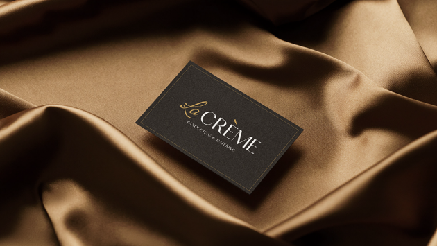
case history
La Crème
Attention to detail, elegance and refinement.
Three pillars of the project we created for La Crème. The choice of naming and the creation of the logo reflect its refined essence. The combination of two colors and fonts create a sinuous line that connects the main services of La Crème: banqueting and catering.
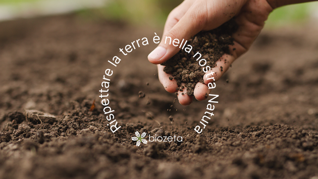
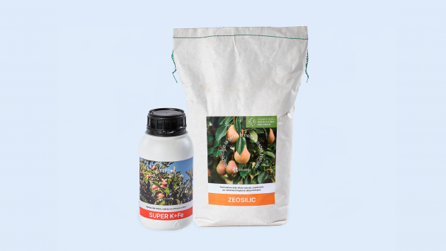
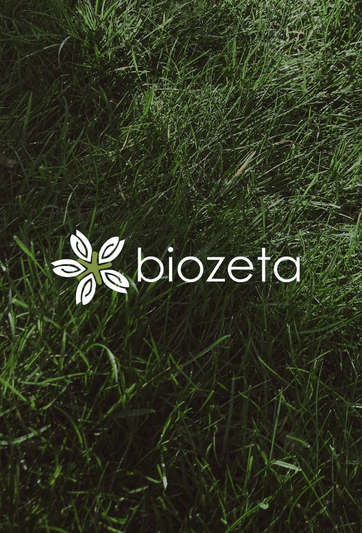
Biozeta
We are proud partners of Biozeta, a company engaged in the production of fertilizers that respect nature, its biodiversity and our land.
We have designed all the new labels for your line of innovative "microbiology friendly" products.
A colorful image for a (truly) green brand.
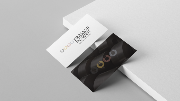
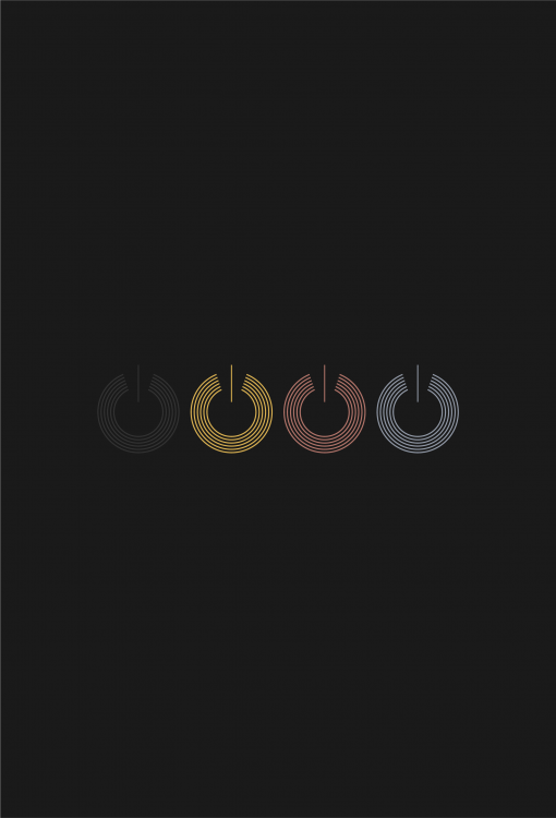
Framor Power
Four coils stylized to symbolize the four product lines: Aluminum & Alloys, Copper, Magnetic Sheet Metal and Alupower.
A young and innovative brand like Framor Power could only have a strong and immediately recognizable identity at a glance.
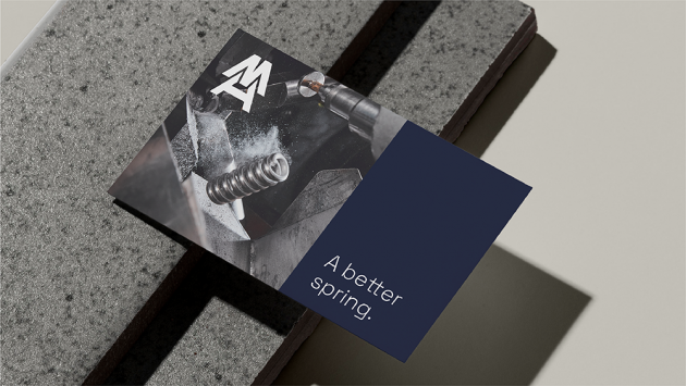
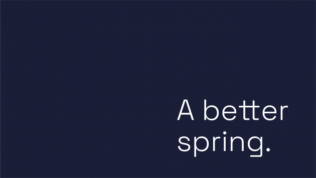
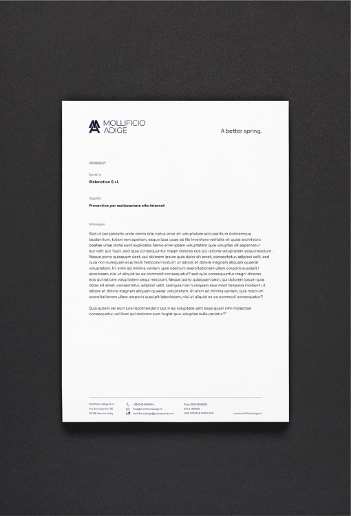
Mollificio Adige
Mollificio Adige, an old company in the Verona area specialized in the production of springs. After more than 60 years of history and activity, they decided to renew their identity.
The restyling of a logo that has a well-established history is no easy task. We have kept its identity, bringing a breath of fresh air.
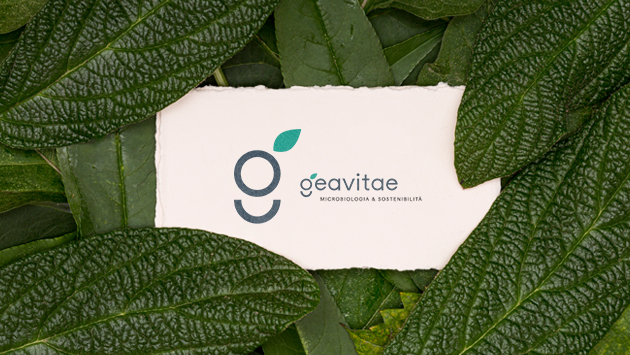
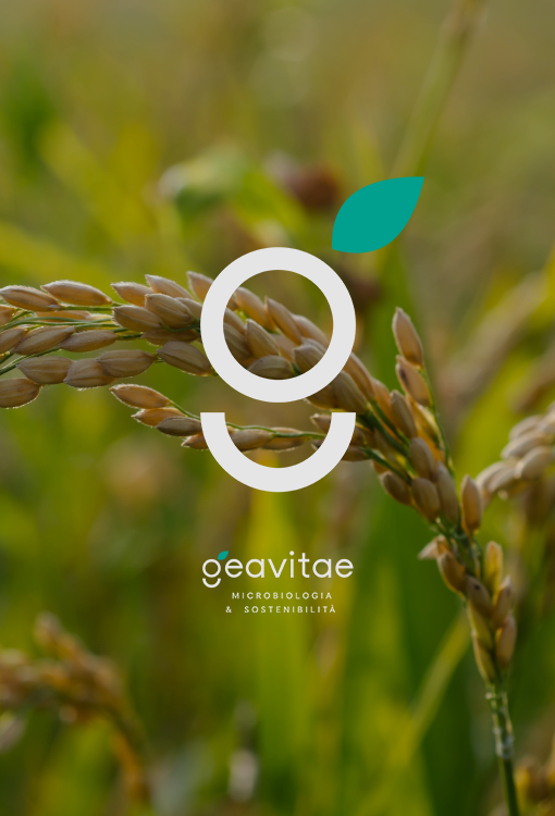
Geavitae
Geavitae is microbiological agriculture, fertility, soil regeneration, restoration of organic matter and microorganisms.
Regenerated soil is a sign of new life, health and change. There was a need for a name and a logo that was the emblem of the circularity of nature... and so Geavitae was born, like a small sprout.
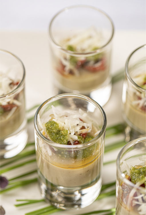
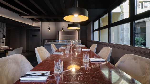
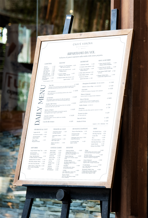
Caffè Verona
A refined image embraces the soul of Caffè Verona.
Simple and elegant lines that leave room for the versatility and taste of its dishes.
We mixed different ingredients to then find the right doses for a logo that expresses its original character.
And here you are Caffè Verona, Restaurant & More.
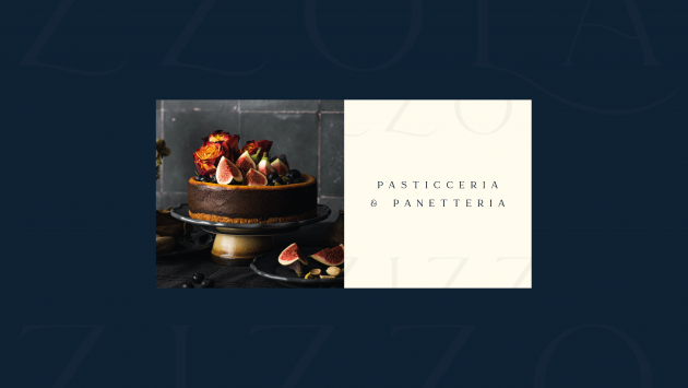
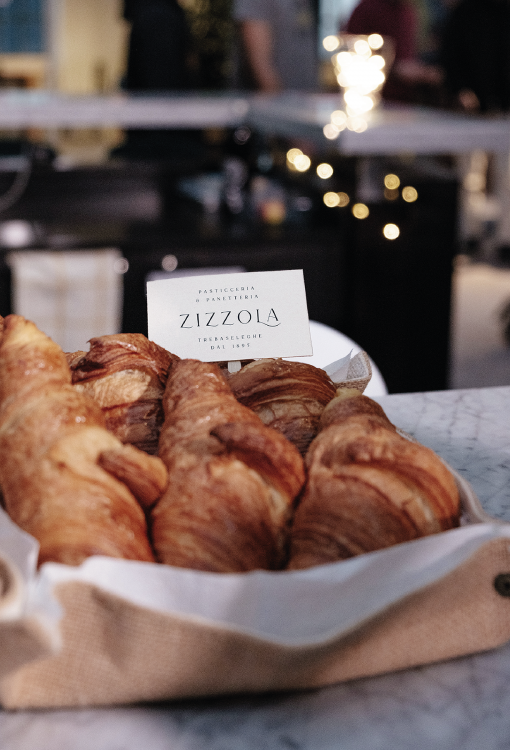
Zizzola
The scent of Zizzola's sweets has been inebriating the streets of Trebaseleghe since 1895.
A historic pastry shop where the goodness of handed down recipes can be savored in every bite. We've brought a little bit of their history into the new logo, graceful and sweet.
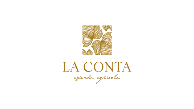
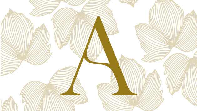
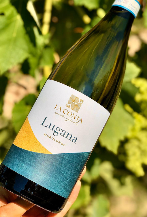
La Conta
There are places that shine with their own light. Like the Lugana DOC, where the particular clayey soil overlooks the southern shore of Lake Garda. From this image, the inspiration for a refined logo, designed starting from botanical elements, and for a young and fresh label... like a dip in the waters of the lake.
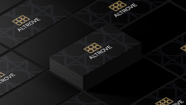
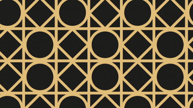
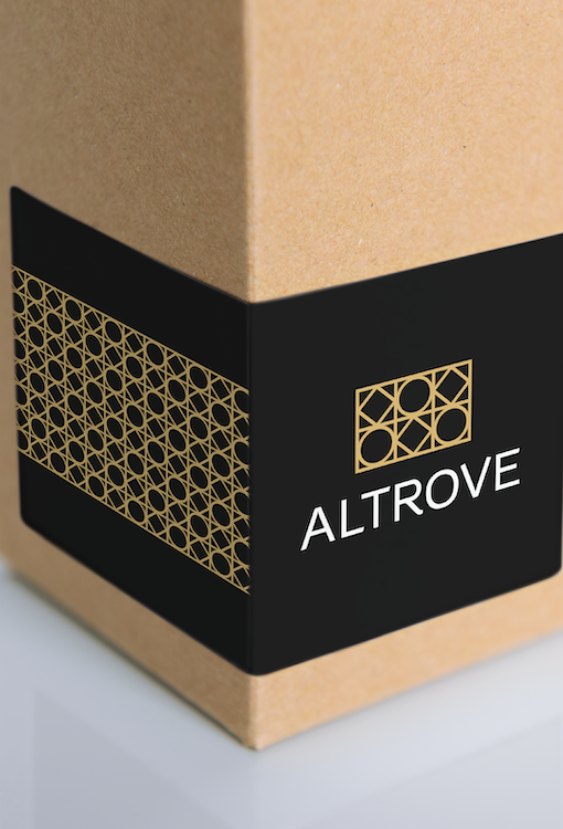
Altrove
Sometimes the visual identity of a brand speaks the language of symbols. This is the case of Altrove, a new wine shop in Verona, whose logo is inspired by the typical majolica tiles that decorate the place. Stylized elements on which the eye can linger and fantasize.
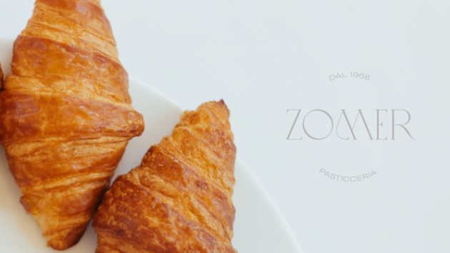
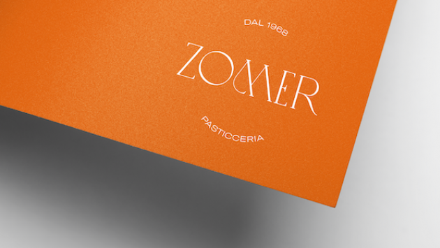
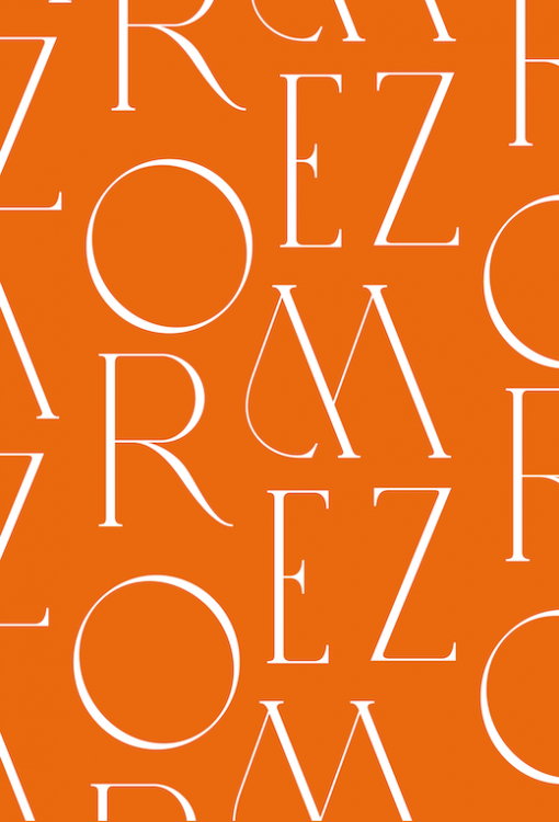
Pasticceria Zomer
Elegant but contemporary, the new logo of Pasticceria Zomer, a small Italian pastry, plays on the alternation of thick and thin strokes, "softened" by soft and circular shapes. And it can be easily declined in print elements, also (and above all) in the form of patterns.
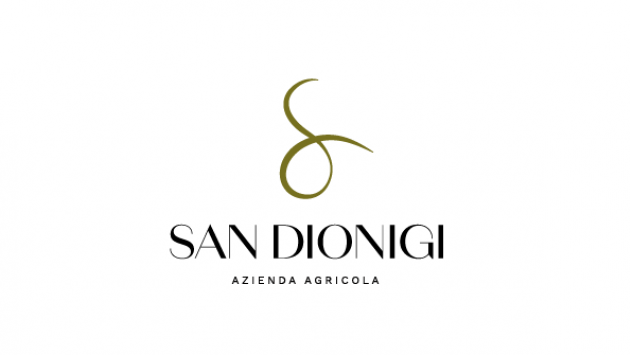
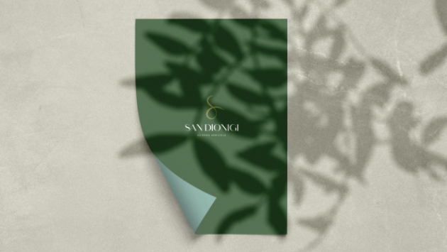
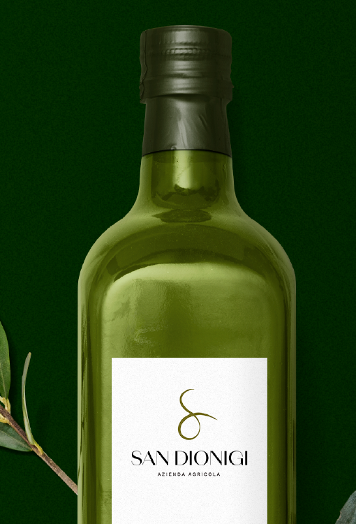
San Dionigi
The interweaving of the rows of vines, the colors of the olive trees: for the San Dionigi olive-growing company we have created a logo capable of expressing all the excellence of their products. An essential image, in its lightning-fast precision.
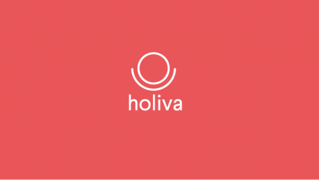
Holiva
Bringing a breath of fresh air and innovation to a sector where it was lacking: this is the mission of Holiva, the economy and taxation podcast, for which we have created a modern and minimal logo. To communicate the identity of a true game-changer.
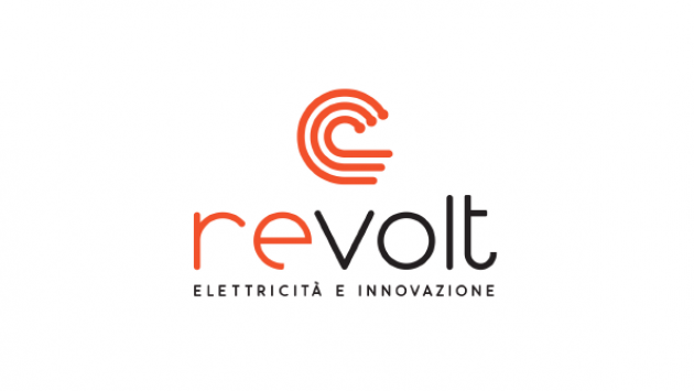
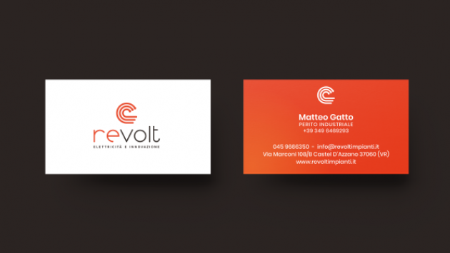
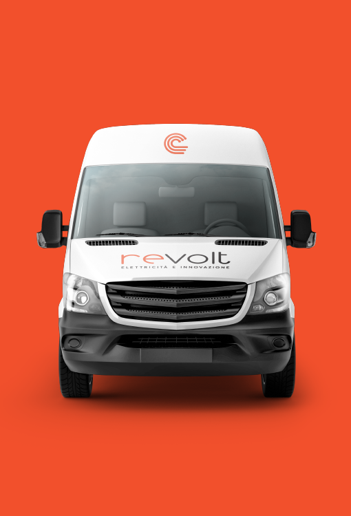
Revolt
Making yourself recognizable can be a difficult task, if you also aspire to be consistent with your sector – in this case electrical engineering and automation. A difficult balance, but undoubtedly fascinating: the reference to electricity, in the name and in the Revolt logo, combines perfectly with an extremely contemporary, certainly unique, coordinated image.
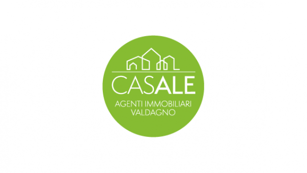
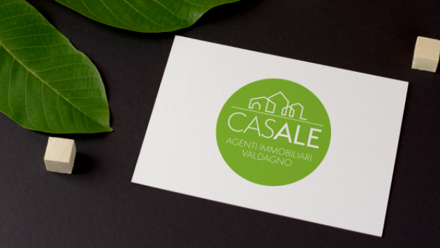
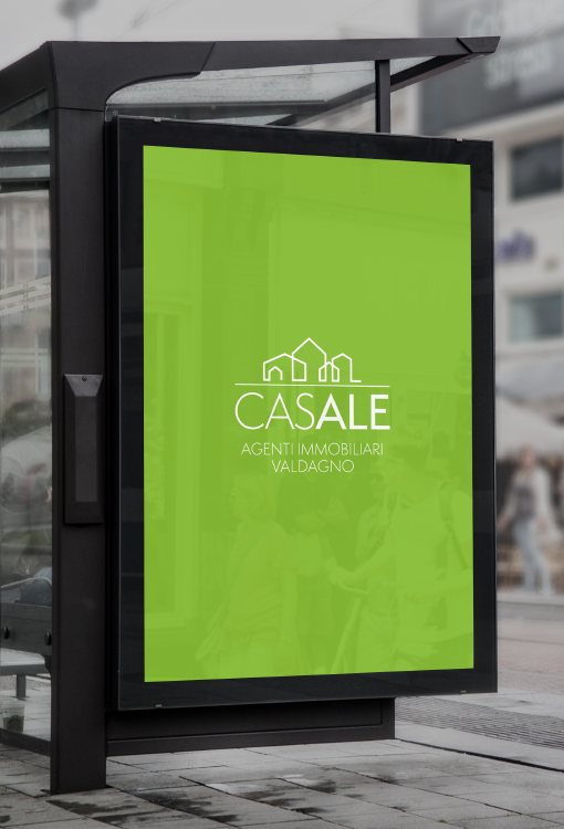
Casale immobiliare
For this real estate agency we studied the new brand starting from a mantra: intuitiveness, familiarity, authority. A simple name, to be accompanied by a modern and minimal logo. To communicate the image of a historic but evolved brand; in step with the times, without drastic breaks with the past.
Do you have an exciting project to discuss?
Contact us!