Realizzazione sito web per l'industria metallica
Realizzazione di un sito web personalizzato per un'esperienza piacevole, efficace e raffinata. Grazie ad una dose equilibrata di creatività, abbiamo trasformato un progetto inizialmente tecnico in una soluzione innovativa e dinamica.
Accessible complexity
Even a very technical site can be aesthetically pleasing. By making good use of spaces and typography, we have obtained a layout that stands out for its readability and lightness.
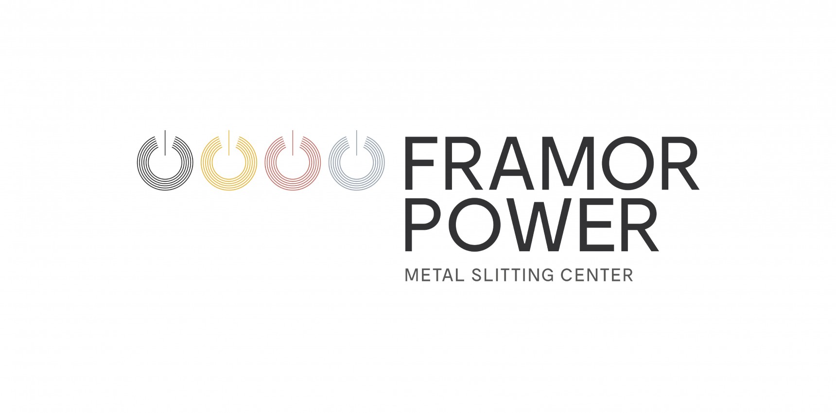
Hidden meanings
Stylized metal coils that (deliberately) recall a much more famous symbol, which is well connected to the brand name. And four colors for four materials, which emerge in the logo and echo throughout the site.
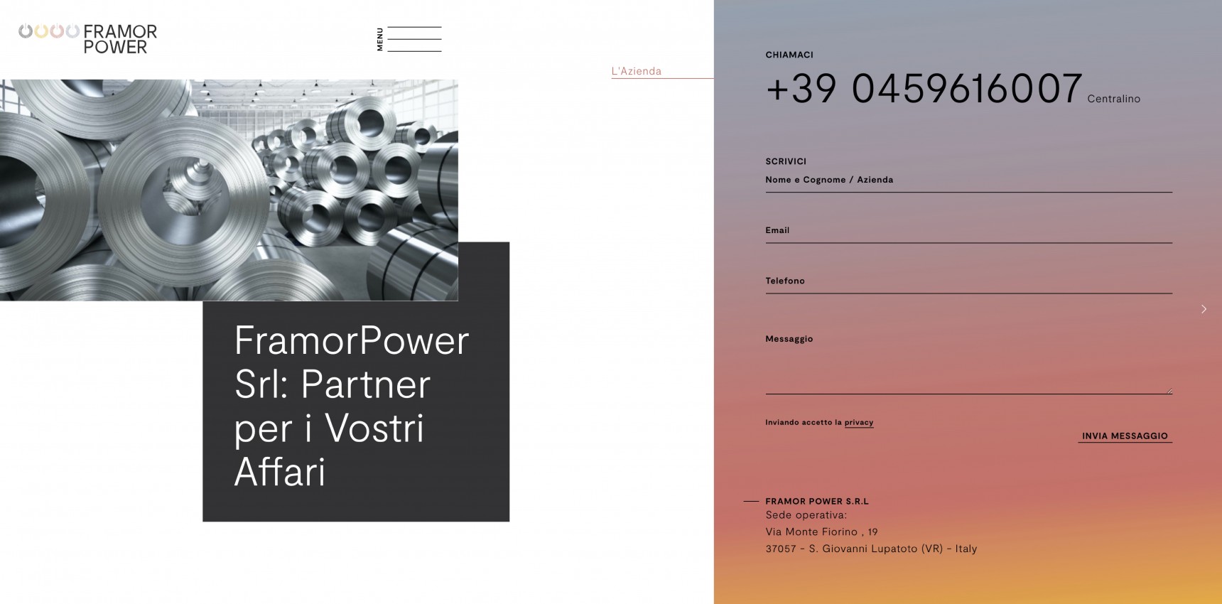
The right middle ground
Synthetic but complete contact form, hideable but always just a click away: a successful combination of effectiveness and discretion.
www.framorpower.com