Lady A
Lady A trasforma la forza primordiale della natura in un’eleganza audace da indossare. Un e-commerce di lusso dove la rarità delle pietre preziose incontra un design digitale sofisticato, celebrando la bellezza naturale attraverso un’esperienza d’acquisto fluida, preziosa e profondamente evocativa.
Zero Wind
Zero Wind: an innovative and quality production. As well as the site created according to their needs!
Sicam
In the field of metal carpentry, Sicam stands out for its innovative vision: telling its digital story with the same precision, strength, and foresight with which it has been shaping metal every day since 1999.
Hotel Europa Sirmione
Colori tenui, navigazione fluida e intuitiva, informazioni chiare e immediate: tutto è stato studiato per riflettere l'atmosfera dell'hotel.
Relais Rossar
Relais Rossar is a corner of paradise on Lake Garda, immersed in nature, where time slows down and every breath smells of serenity. Their website is a reflection of this magic. A unique sensory experience. A digital journey that perfectly anticipates an unforgettable stay.
Ethnoex
A website designed to reflect the explosive power of the Filipino communities, with an audacious and memorable design, and a highly intuitive interface for simple and efficient management.
CLAB
An ambitious site for an architectural firm that makes ambition its calling card, continually putting itself out there: the results speak for them; the beauty of the site also speaks for us...
Ros
Avete mai navigato un sito web per tanto tempo senza mai stancarvi per quanto è bello? E vi è mai capitato con un sito B2B del settore metallurgico?
N0? Allora provate con il sito di Ros.
Hospitality Peschiera e Castelnuovo
Come dare valore alle bellezze territoriali e alle attrazioni turistiche di un luogo come il Lago di Garda?
Con un fine nobile come quello dell'Associazione Alberghi e Campeggi di Peschiera del Garda e Castelnuovo, e con un sito web come quello che abbiamo creato per loro!
La Versione di Gunter
Gunter is discovery, it is emotion, fragrance, notes and much more. Not just wines, but a sensory experience.
A journey to be experienced using the five senses, from the comfort of home. We put a face to an ambitious and extremely romantic project: Gunter's Version.
Elmas Transfer
Abbiamo dato vita a un vero e proprio motore di ricerca di transfer nella splendida cornice della Sardegna, per una vacanza organizzata alla perfezione.
Marana Forni
Marana ovens stand out for their efficiency and design: hence the need to explain every aspect, while still managing to amaze. We have balanced these two needs by exploiting engaging mini-videos, few icons, and simple and intuitive renderings.
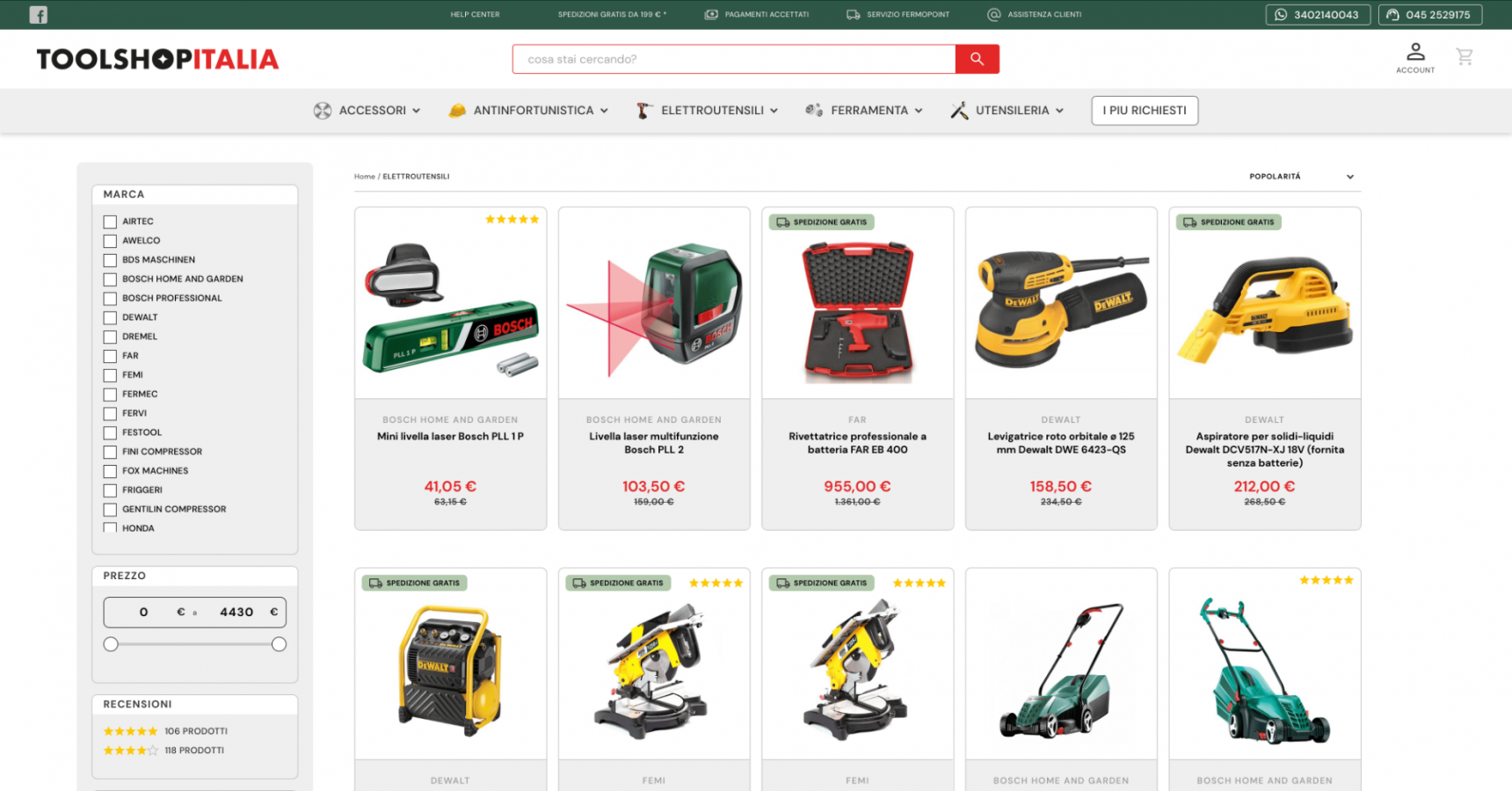
Toolshop Italia
An e-commerce with such a vast catalog requires clear ideas, an orderly structure and obsessive attention to usability. This is the essential content of our "toolbox".
Yunno
Yunno is an innovative benefit start-up that aims to improve the efficiency of processes and increase the productivity of the companies they target by taking care of the well-being of their employees. They asked us for an emotional look and we gave it... literally!
Ilmur
The site opens with an emotional video: expert hands handle the coffee beans with care. It is precisely with attention and care that we have created the e-commerce for Ilmur. Step by step, to take the visitor on a journey through the history of Ilmur and coffee.
Chalet Corvara
A (digital) window on the Dolomites.
A chalet where you can live in relaxation and in nature. We have created a site composed of soft colors and impactful images.
Manufactotum
Precision, beauty, and functionality: a custom-sculpted site by katana strokes.
Quoin Studio
The team at Quoin Studio chose us to design a site capable of telling the story of their business: and they know a thing or two about design!
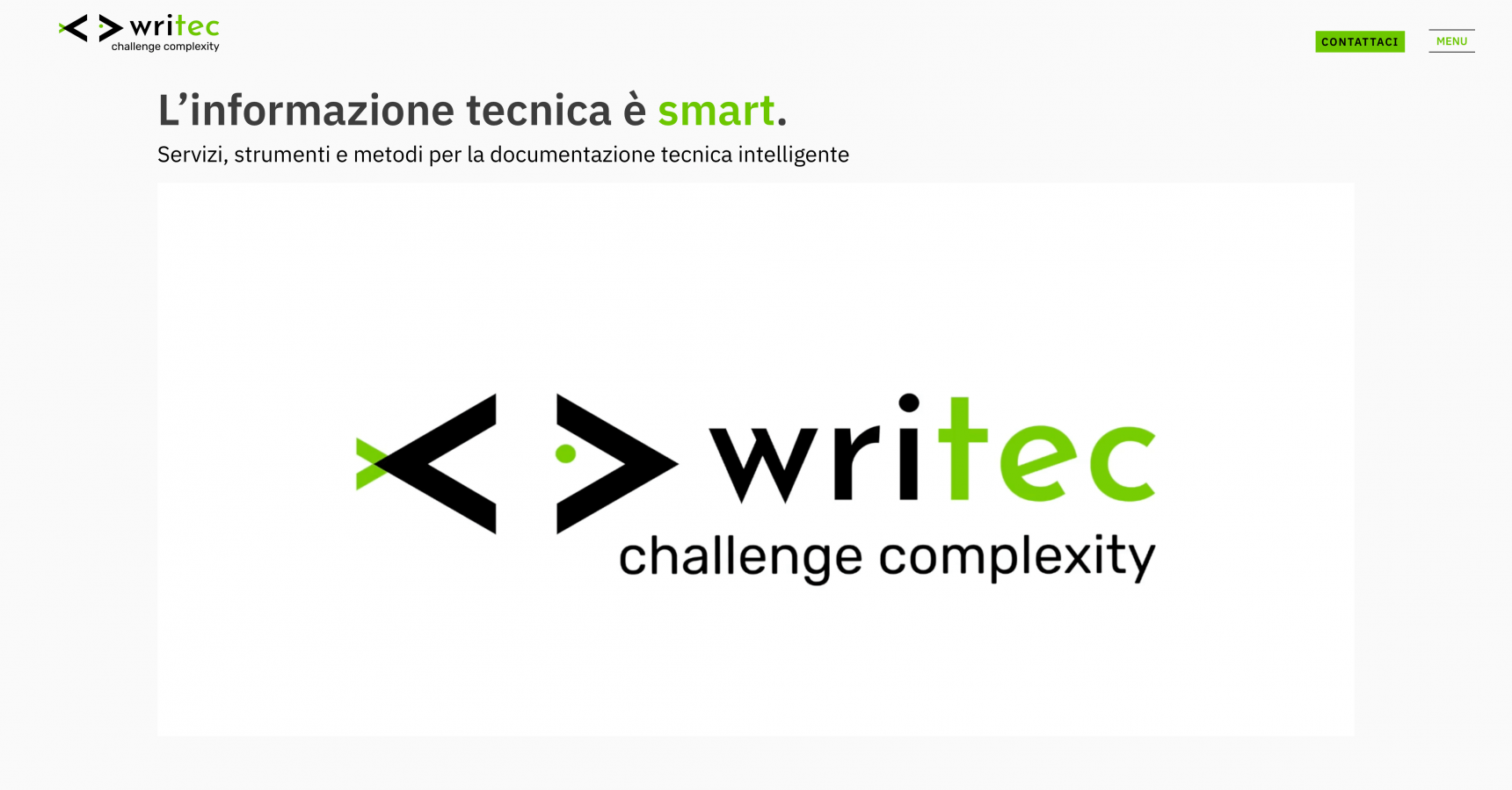
Writec
What do we have in common with Writec? What we call the 3 Cs: competency, customer care and clarity. 3 Cs that, on the site, jump out at you right from the homepage...
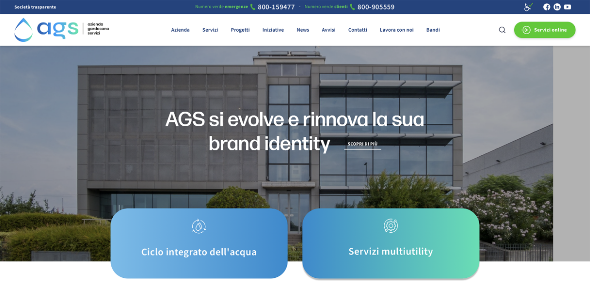
AGS
Azienda Gardesana Servizi is a multi-service company that follows innovation. Thanks to their services and professionalism, utilities will no longer be a problem! They don't lack grit, in fact they have also extended to services such as public lighting, property management, and much more.
Onoblo
Colorful, cheerful and bright. Colors and fonts can make a difference. Change is a constant in corporate culture, and more! For Onoblo we used creativity, colors and shapes to give life to the concept of "corporate transformation".
M15
Vision, sustainability and redevelopment.
Three elements of a space and home of professions.
M15 is the representation of a change, the vision of a future to…relive!
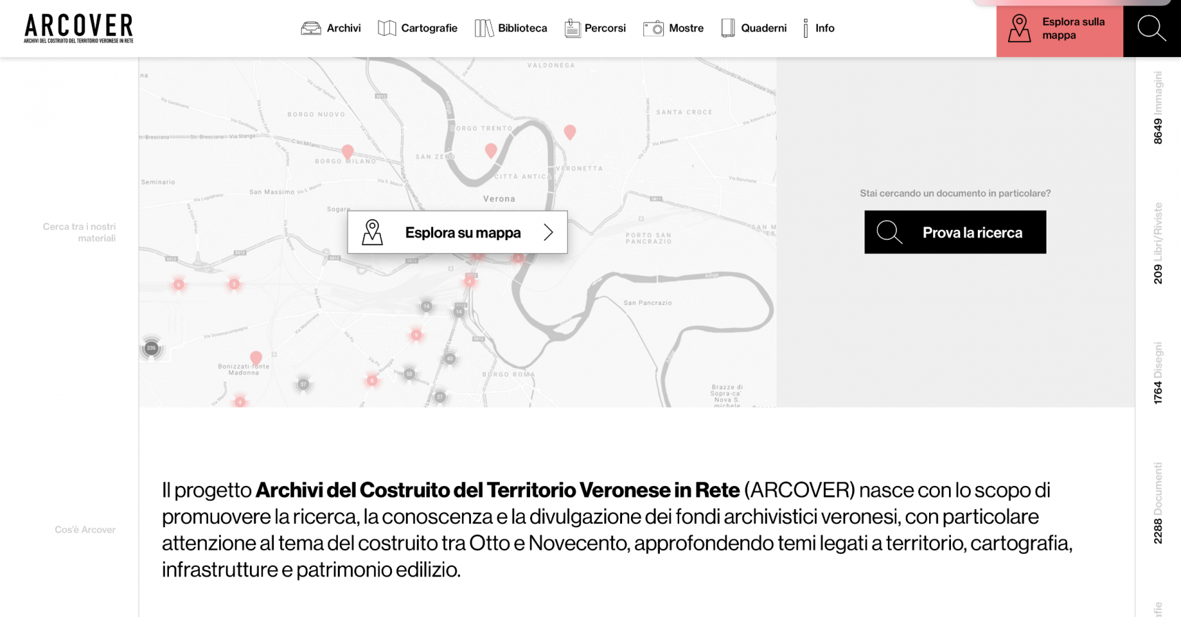
Arcover
A project that arises from the desire to promote research, knowledge and dissemination of Veronese archival collections. The history of the nineteenth century now digitized.
Mollificio Adige
In the foreground, the dynamism of an activity that has been going on for more than 65 years. Vital layout, in constant motion. In a nutshell: Mollificio Adige.
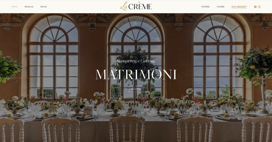
La Crème
Elegance, delicacy and professionalism. Three adjectives that encapsulate the essence of La Crème and that have guided us towards the creation of their website.
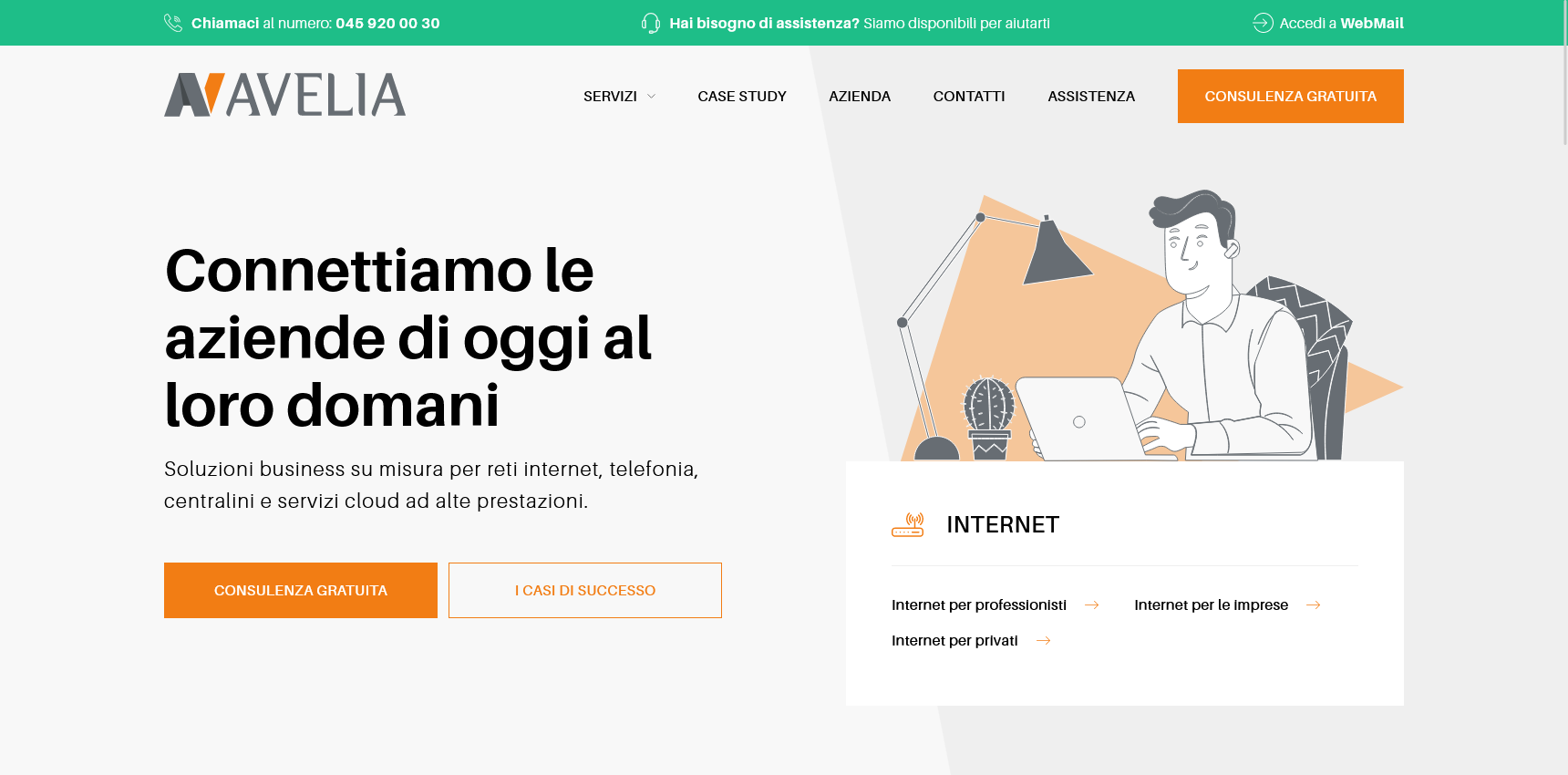
Avelia
ICT and IT are synonyms of Avelia. Company specialized in tailor-made business solutions for internet networks, telephony, iCloud services and much more.
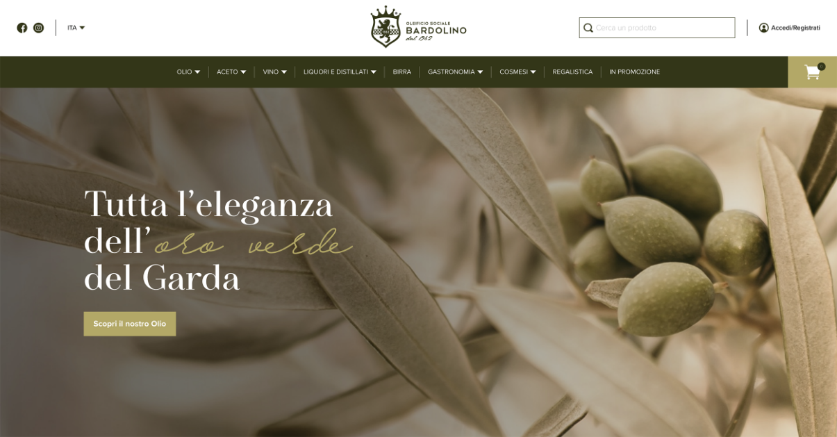
Oleificio Sociale Bardolino
Over the years, the Oleificio Sociale di Bardolino has become much more than a store: it is a point of reference for lovers of gastronomy, wine, liqueurs, local food and much more.
Framor Power
When logo and site are born together, the result can only be exciting. For Framor Power we have created a coherent and homogeneous visual identity, able to tell the story of the company and its personality.
Mastri italiani
The seductive embrace between shades of gold and dark tones, the refined graces of the font and the precious b/w inserts take us into the world of luxury craftsmanship.
Luciano Arduini
Large impact photographs with vintage tones are the leitmotif of a wine history that has its roots in tradition.
Do you have an exciting project to discuss?
Contact us!